Role: UX/UI Design, Art Direction, Graphic Design | Client: personal project
Tools: Figma
Timeline: 1 week
Step 1: Defining the Goals
The first step in the redesign was defining the goals. I outlined the problems the company was trying to solve. I tried to understand what end users were looking for and how new solutions could improve the performance and functionality of the app.

Goals of " Too Good To Go "
Reducing Food Waste
The core goal is to reduce food waste by enabling consumers to purchase surplus food from restaurants, cafes, supermarkets, and other food retailers at a discounted price. This helps prevent edible food from being thrown away.
The core goal is to reduce food waste by enabling consumers to purchase surplus food from restaurants, cafes, supermarkets, and other food retailers at a discounted price. This helps prevent edible food from being thrown away.
Raising Awareness
The company aims to raise awareness about the issue of food waste and its environmental impact. By highlighting how much food is wasted and promoting their solution, they hope to encourage more sustainable food consumption habits.
The company aims to raise awareness about the issue of food waste and its environmental impact. By highlighting how much food is wasted and promoting their solution, they hope to encourage more sustainable food consumption habits.
Supporting Businesses
"Too Good To Go" supports food businesses by helping them minimize their food waste, turn a potential loss into revenue, and attract new customers through their platform.
"Too Good To Go" supports food businesses by helping them minimize their food waste, turn a potential loss into revenue, and attract new customers through their platform.
Environmental Impact
By reducing food waste, the company contributes to decreasing the overall carbon footprint associated with food production, distribution, and disposal. This aligns with broader environmental sustainability goals.
By reducing food waste, the company contributes to decreasing the overall carbon footprint associated with food production, distribution, and disposal. This aligns with broader environmental sustainability goals.
Step 2: Gathering Customer Feedback
The next step was to look at how customers use the current version of the app. Since I was redesigning an existing app, I used qualitative data to understand the status quo user experience.
Qualitative data: reviews in the Google Play Store and the App Store, messages to customer support, comments on social media pages, etc.
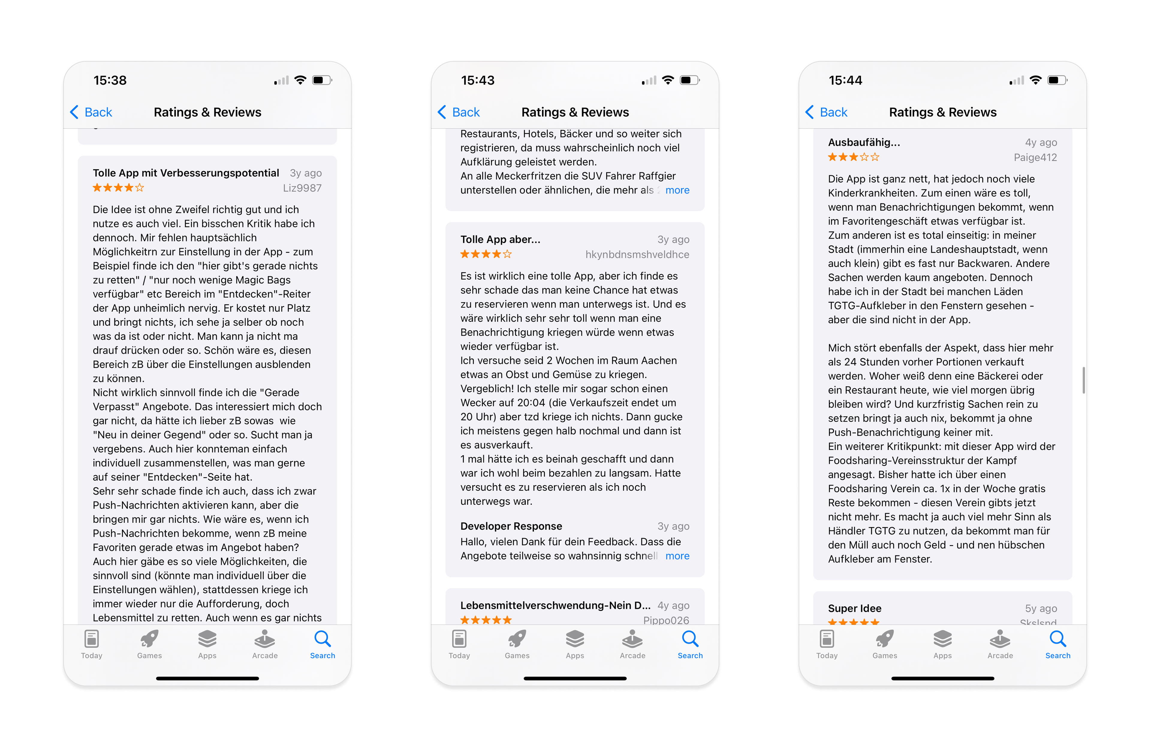
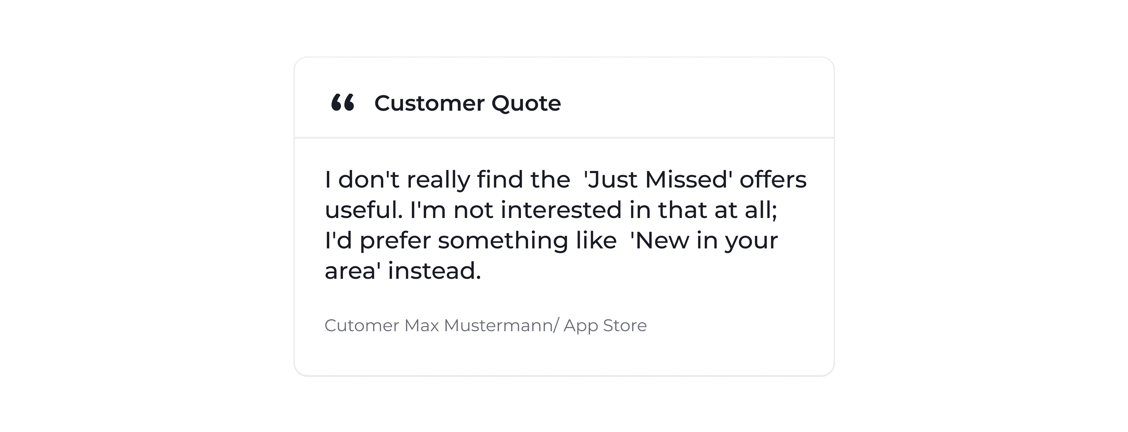
Generally, there is good feedback for the app on the app store. However, there are some types of feedback that often repeat. Here are some points that I noticed:
• Users complain about a lot of unuseful information and categories.• Users complain about limited offers.
• Usually, there are only pastries available
Step 3. UX Evaluation of the Current Design
I've spent some time evaluating the current version of the application. Although it may not be perfect, I recognize that each aspect of the app likely reflects significant effort and research.
Step 4. Review the Competition
I believe that analyzing competitors’ applications is an excellent way to stay updated on the latest design trends and gain insights into why some customers prefer other products over ours.
After examining food delivery apps like Uber Eats and Glovo, several key insights emerged:
• Both apps allow users to quickly sort restaurant categories directly from the homepage.
• They feature a streamlined selection of categories that are relevant and useful.
• The app designs emphasize clean layouts with easy-to-read card formats.
• Detailed ranking information is prominently displayed.
• Users can efficiently navigate through categories and cuisine types right from the initial screens, minimizing unnecessary scrolling.
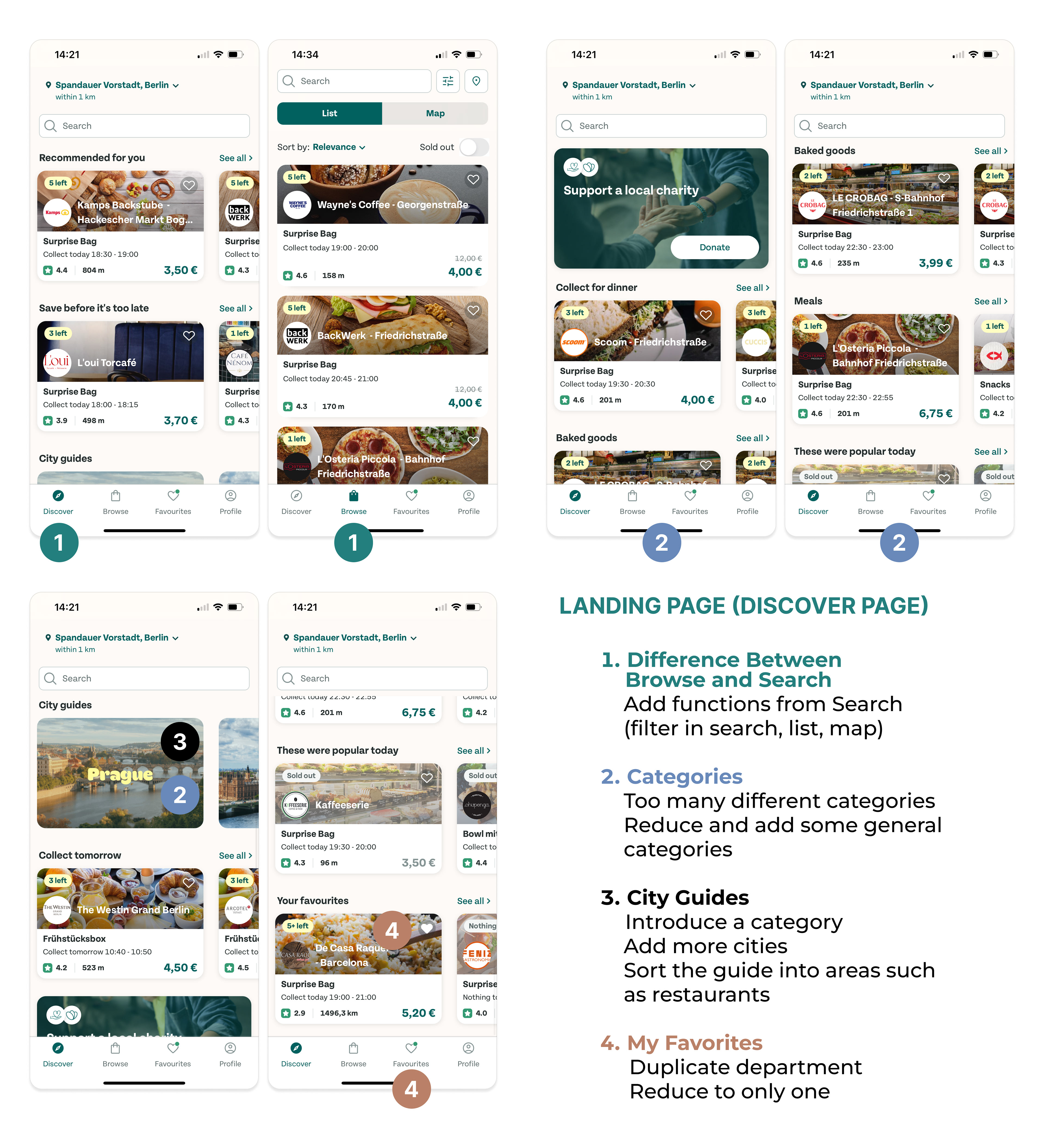
Step 5. Create a New Design
Lo-Fi Wireframes

Hi-Fi Wireframes
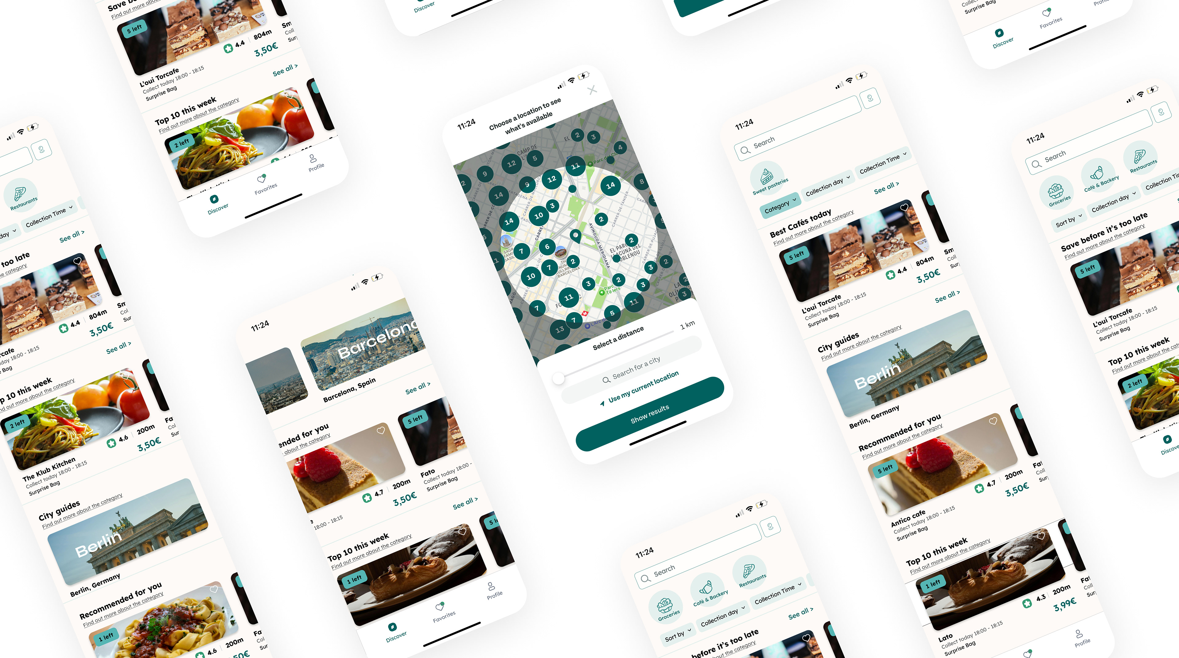
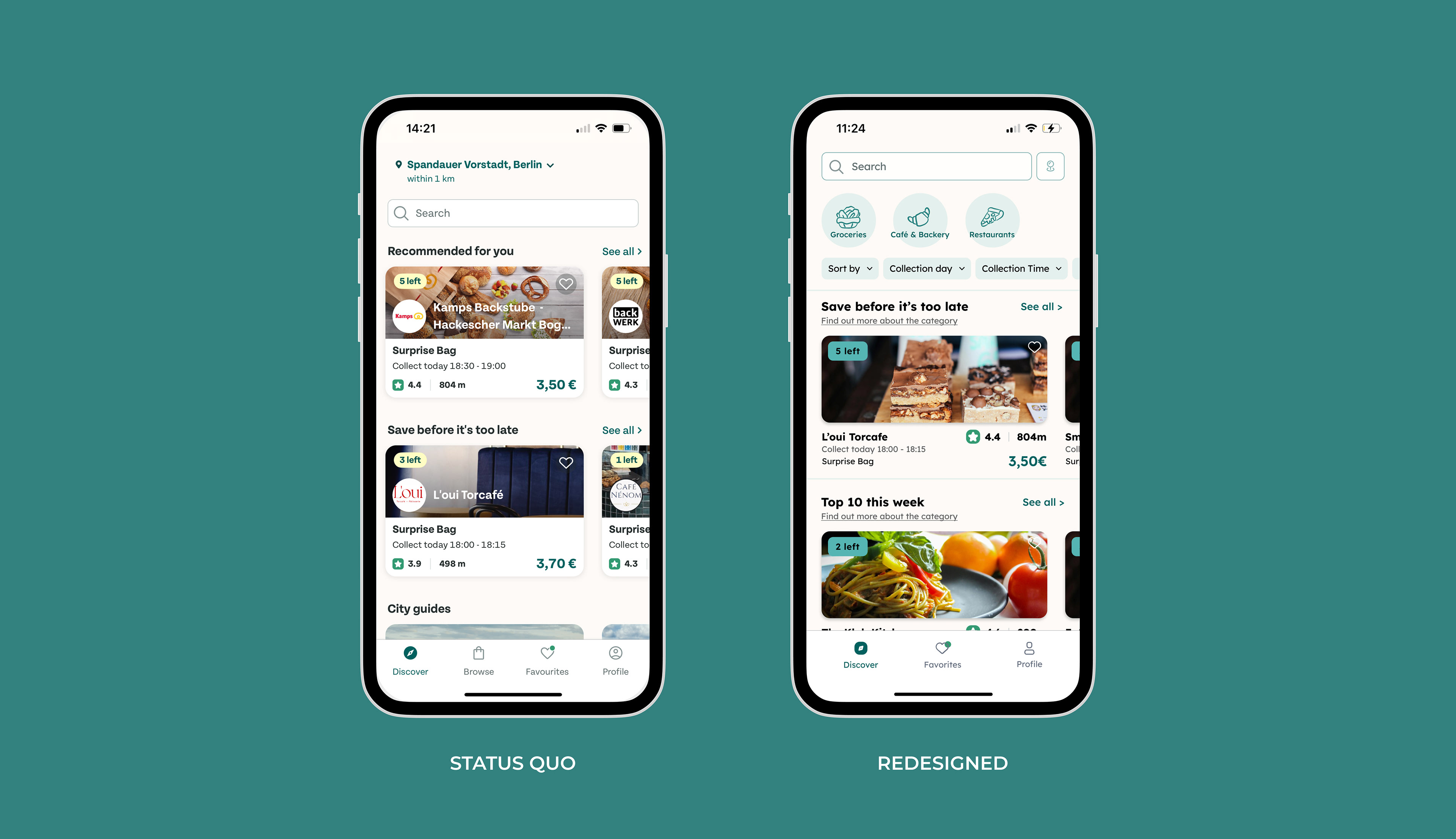
Result:
• Enhanced navigation panel
• Discover section with advanced search, filtering, and location settings
• Minimalist UI design
• Tooltips with explanations for each category type
• Filtering function by food categories
• Discover section with advanced search, filtering, and location settings
• Minimalist UI design
• Tooltips with explanations for each category type
• Filtering function by food categories